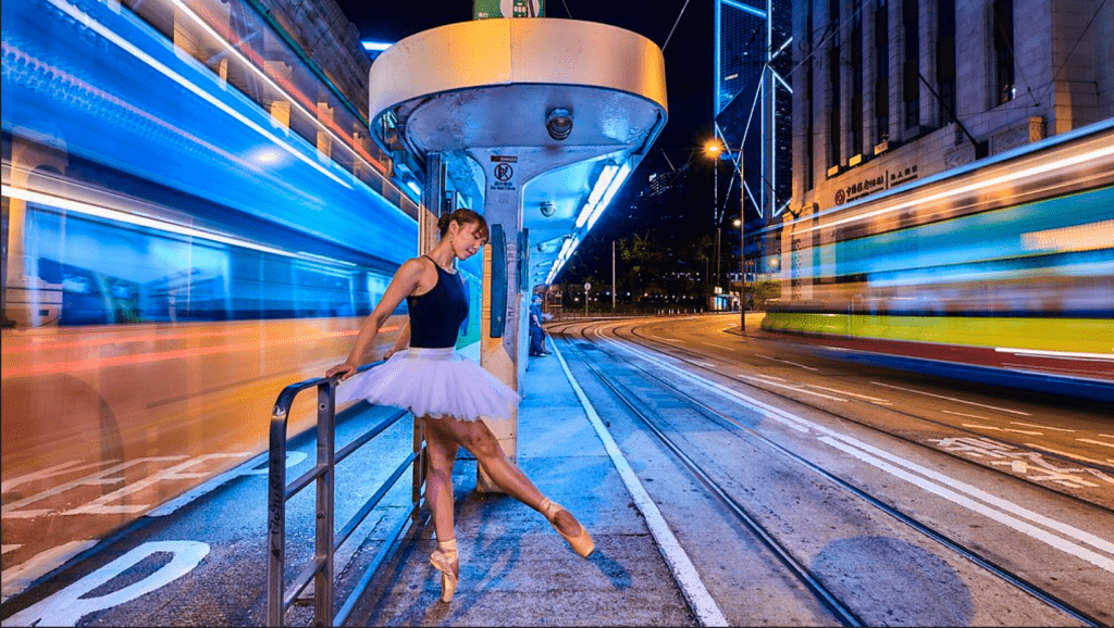
The Hong Kong Ballet is one of the top ballet companies in Asia. To celebrate the 40th anniversary of the Hong Kong Ballet, the company’s artistic director – Septime Webre designed and created a boundary-pushing brand campaign called “Never Standing Still”, to embody the enthusiasm and vision of this premier ballet company. This campaign defines Hong Kong Ballet as: “moving forward, never standing still”. The series not only includes video recordings, but it also created several iconic photographs as a new advertising design style, which has changed the face of how traditional ballet has been portrayed in the past.
On the Hong Kong Ballet’s 40th-anniversary poster series, the American Design Army advertising agency was invited by the Hong Kong Ballet to create a tailor-made creative marketing campaign named “Never Stand Still”. In an extravagant display, a gorgeous show of music, dance, light and costumes entertained ballet fans around the world, as well as glittering in the international dance scene. The dancers of the Hong Kong Ballet put on eye-catching fluorescent green, pink and ice blue costumes and jumped out of the rehearsal room to dance in various attractions in Hong Kong, including historical landmarks, basketball courts, roads, ferries and tea houses. Webre took a series of photos displaying the unique characteristics of Hong Kong, breaking the common impression that “ballet is like wearing a veil and standing on tiptoes”, posing in an elegant posture. These bold images with the surrounding buildings and scenery have become an interesting sight, that incorporates Hong Kong characteristics with dance.
Through the new images, animations and photography of the contemporary ballet, the Hong Kong Ballet presents a new approach to everyone, fully demonstrating how the vitality and culture of Hong Kong blends the agility of the dancers, highlighting the unique beauty of ballet and giving Hong Kong Ballet deeply rooted in traditional culture and a unique set of visual language. The signature colour spectrum also reflects the characteristics of this city, with the main colour tones named Kowloon Blue and Heritage Red. Pum Lefebure, one of the founders of Design Army, said that the Hong Kong Ballet has been committed to traditional classical ballet for many years, and has been more active in making a perfect combination with modern dance. The team hopes to change a new vision since most people worldwide have an impression about ballet is equivalent to the old school. Therefore, for this season, the Hong Kong Ballet will mix more innovative elements that were never associated with western art cultural and ballet in the past, such as kung fu and lion dance skills, which are traditional Chinese examples of culture and are. The Hong Kong Ballet hopes that these unexpected elements will add unforgettable freshness. Meanwhile, Webre said that the new vision adopted and commenced last year aims for the dance company to connect with the modern. “The new vision positions the dance company as the people of this era, and the colours used are drawn from the colours of Hong Kong-both ancient and modern. I especially like the bold impression created by the contrast between the dancer’s body and the surrounding buildings.” This series campaign ballet promotion film and photography combine traditional and modern imagery that echoes the Hong Kong Ballet’s “Never Standing Still” approach by completely reforming people’s old-fashioned impression of ballet. The spirit of progress and never-ending purpose makes people see the new sparks of dance that are bursting out!
If you wish to know more, and to see examples of the seasonal campaigns, please visit the website of the Hong Kong Ballet (https://hkballet.com/en/) or Instagram @hongkongballet.
